Minutia : Noun; the small, precise, or trivial details of something.
Despite how simple it might appear in the concept stage, developing a web site is a long and difficult process. Your company or organization can do incredible things. You want to communicate the limitless possibilities that you can provide to your clients, and you want all of that information to be front and center so that nothing is forgotten or omitted.
I want to caution you with two simple words: Ling’s Cars.
…busy enough for you? This is an example, albeit an extreme one, of trying to communicate as much information as possible that results in an overwhelming visual appearance. Web presences like this do not help your conversion at all, and it can actually turn your qualified leads away.
Now, you might think that this web site is simply too crazy to be legit; and you’d be right. Ling Valentine’s web presence is merely a gimmick; her oversaturated homepage is part of a satirical marketing campaign, and for the past decade it has actually been pretty effective. But if you’re not careful, your own web page can quickly start to look just as overwhelming, just as chaotic, and just as confusing, but without the convenient excuse of satire.
Your Website Is Not for You
Granted, you are the one signing the checks, you are the one designing the website, and you are the one whose business hinges on its success or failure. But despite all of that, your web site is not for you. Instead, your website should be tailored to your clients; their needs, their wishes, their questions, and above all else, their ease of access.
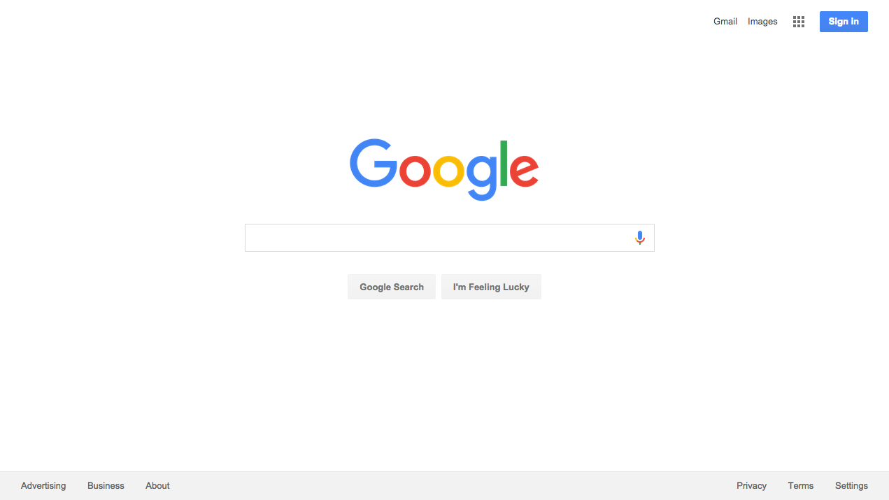
Audience attention spans are fleeting. This means that your most important content should be as streamlined as possible, better guiding users towards the call to action of each page. This means leaving minutia out of the equation, particularly on your homepage. Richa Jain (of sitepoint.com) calls attention to the case of Google VS. Yahoo to further emphasize this point. If you were hoping to search for a term and gather information on it, which search engine homepage would you be more inclined to visit first?

WHAT STAYS, WHAT GOES?
We get it; it can be difficult to decide which pieces of content are most important to you. But again, your web site is not being built for your benefit; so, let your audience decide what is important. Analyze the questions that are asked most frequently, study your audience’s interests, and determine what matters most to them. Build content that appeals to them, explains to them why your business is best suited for them, and leads them to trust you.
Copy content should be woven carefully and kept to an absolute minimum. You may have an amazing story to tell, or an incredible staff that you want to speak about, or even a grand value system that sets you apart from your competitors; but ask yourself, are these the first things that your audience would want to hear about? Perhaps; or, depending on your audience, perhaps they might be more interested in your service offering. Different audiences have different preferences, so it’s up to you to determine what those preferences will be. However, as a general rule, if you wouldn’t include it in your elevator pitch, don’t highlight it on your web site.
YOU CAN STILL BE CREATIVE
Limiting the copy content and streamlining your information doesn’t mean that you can’t tell your company’s story, highlight your staff, or alert your clients to new developments. A blog can be an incredible resource for any website, as it gives you a place to share your company news without impairing user experience. In addition, using video to convey your story, promotions, or any extra elements allows users to decide whether or not they want to hear the minutia of your company. If users click on the play button, you’re building their trust; but if they don’t, their experience is in no way deteriorated.
In the end, your website is the first point of contact for many of your potential clients. You can either make a good impression, make a bad impression, or make no impression at all. Give yourself the best chance that you can to make a good impression; build a website with user experience in mind. Keep it simple, keep it clean, and be as direct as possible.
If you have any questions or concerns about building a website for your clients’ benefit, we’d love to talk to you about it. Call our office at 410.853.7892 or send us an email via info@myrender.com, and get started on building a new web presence today!


 604 E Joppa Road