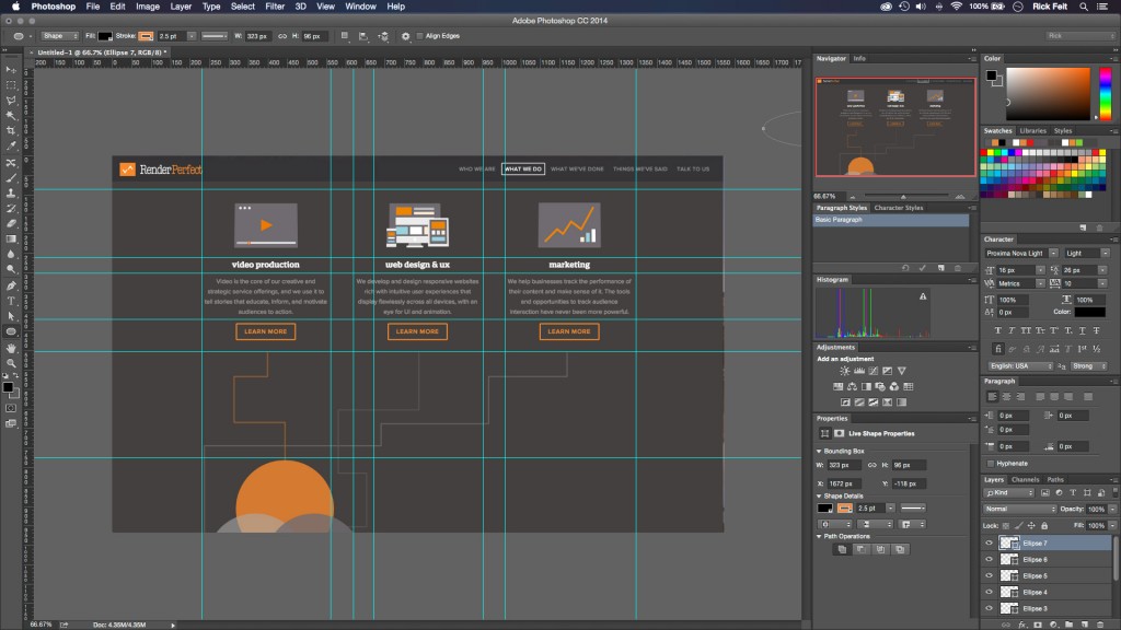
It’s finally here! At last, Render Perfect has launched its all-new company website. Our new web interface embraces the fully-interactive user experience that we pride ourselves on being able to deliver to our clients. From integrated video to custom-coded page animations, we believe that our 2015 revamp reflects everything that we are and everything that we do.
WHY THE REBUILD?
Render Perfect was founded by company president Ryan Spindler in 2002. In the 13 years since, we have pushed ourselves to stay modern, contemporary, and digitally savvy. Though our organic search ranking has always been fairly high and our stream of business is consistent, we have felt for some time now that our existing web presence was not accurately reflecting our abilities as innovative designers and storytellers. We wanted a website that would represent us accurately to our inbound visitors, and tell our own story in unique and personable way. Though we are a small company, we accomplish big things!
We have been working tirelessly over the course of the last two years to enhance and stylize the RPP Website for its 2015 iteration. Just as with any other project, we followed our company production model to get this project completed….from Strategy, to Content, to Distribution, and finally, to Results.
Our team met internally several times to plan a more organized sitemap, to measure the feedback on our existing website, and to draw storyboards for the website animations. We discussed several different styles and put together several different mock-ups to see exactly which style and format would best serve our visitors’ user experience. From there, we took great care to build each and every website element independently and code them all into a responsive environment, being meticulous about every individual element and every word of copy. We designed a number of unique project assets and strategies for our relaunch, including…
- Responsive Cell Animation
- Transitional Elements Between Pages
- Incorporation of Video Throughout
- Custom-Coding from Scratch
- Custom CSS Animation
In March of 2015, we went live with our redesign, opening our interface to the entire world. Thus far, we’ve received a handful of compliments on our new look and our simplistic navigation. We hope that our new web presence will always serve as a reminder to our clientele of everything that Render Perfect Productions has to offer.
![]()
CHECK US OUT
If you haven’t yet toured our new web interface, we strongly encourage you to do so. Our goal is to remain vigilant and adaptive to the ever-evolving world of digital communication. We know that it is only through public interaction that we are able to learn and grow as a company. For this reason, we welcome any feedback we can get on the grand relaunch…the good, the bad, and the ugly.


 604 E Joppa Road